Aug 6, 2024
Aug 6, 2024
Aug 6, 2024
ZAP 2.0: Evolution Not Revolution
ZAP 2.0: Evolution Not Revolution
ZAP 2.0: Evolution Not Revolution
New Website, New Launch
New Website, New Launch
New Website, New Launch


Gm Zappers!
The past few months has been a wild ride.
We’ve won the Blast Big Bang competition, launched three products, onboarded hundreds of thousands of users to our platform, started monetising, and raised $15m on the back of the early traction and promise our company has owned - with a massive thank you especially to the community of ZAP Vault Holders.
ZAP 2.0 ⚡
In this early phase we’ve been talking to our users, taking stock of the macro picture and tactically putting together a vision for what the future of ZAP looks like. We’ve been brainstorming, wireframing, designing, coding, and strategising.
We’re now beyond excited to share ZAP 2.0 with the world.
ZAP 2.0 is the natural evolution of ZAP. There are a few major changes, and a number of smaller ones. Our vision to become the place communities come to launch tokens—whether that’s through an airdrop, coin creator or more traditional launchpad style raise—remains the same, but how we deliver on this vision has definitely changed.
In this article, we’ll go through some of the bigger changes (and some of the smaller ones) that make ZAP 2.0 a change step from our original product
Addition of Base Network 🔵
Probably one of the bigger changes we’ve implemented is the addition of the Base Network onto ZAP. As a team, we are super bullish on the Base ecosystem. The mission of Base "To build a global onchain economy that increases innovation, creativity, and freedom" ties closely into ZAP’s.
As well as this, the on-chain activity that Base network has seen recently can’t be argued with. Base has quickly come to be the EVM chain of choice when it comes to new token activity, which is precisely the market that ZAP plays in.
Our new Launch product (more on that later) as well as Labs and Drops are now open to Base projects. We’ll also be launching a Base native campaign shortly (sorry we can’t reveal more on that yet) to kickstart the flywheel of onboarding Base users to the ZAP ecosystem.
As mentioned in our recent post, we’ll continue providing support for the Blast network, but for the next few weeks while we get the Base flywheel moving you will a Base focus on all of our products. We fully believe in the promise of Blast as the yield-native chain, but we’re also making sure we provide a clear, simple UX for new users as we expand to Base with the coming campaigns.
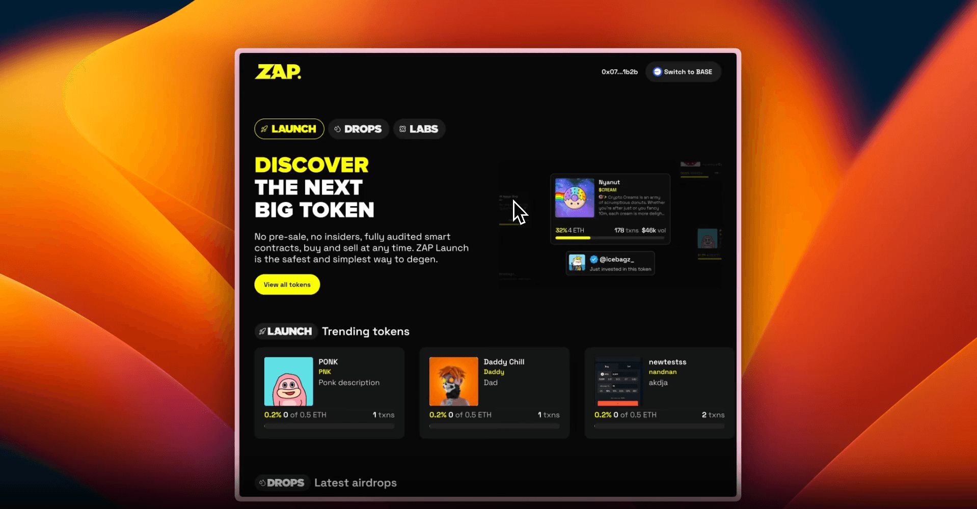
Brand new ZAP Launches
Our original launches product failed to get as much traction or success as our Drops product. We’ve spent the last few months trying to figure out why. While there’s definitely a market elements to this, with lacklustre demand for the Blast blockchain from token developers and degens, we also heard loud and clear that our Launch product was just too complicated.
We prioritised customisation, thinking that if we could deliver a super sophisticated token launcher experience, developers would love the flexibility that it offered. In hindsight, it would appear we built a product for a market that doesn’t quite exist yet, developers either want fully custom tokens, or are happy with a simple template.
Simplified Token Creation
10 seconds and 3 bucks. That’s all it now takes to launch a token on ZAP. We’ve completely overhauled our token launch experience to prioritise simplicity above all else. We’ve also implemented some pretty smart bonding curve logic, so that tokens can be launched with zero liquidity. Pretty cool.
Check out the whole launch experience in the video below 👇🏽
Transparency First
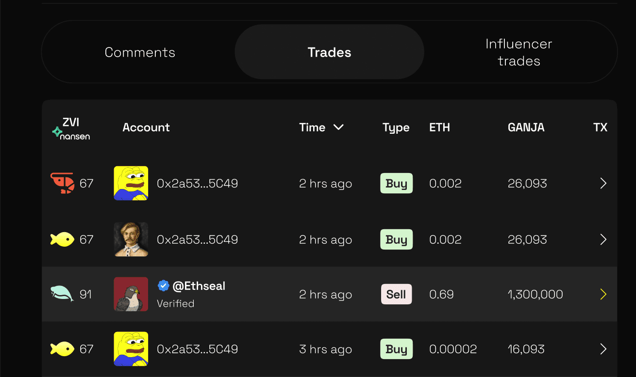
One of the key issues users of token launchers said they faced was a lack of transparency around the trading activity in these tokens. People want a safe playground to launch and buy new tokens and other platforms were failing to deliver.
That’s why we’ve partnered with Nansen to assign all users a ZAP Value Index (ZVI). This index takes into account multiple parameters like a user’s trading history, amount spent on gas, and other on-chain activity, to give users an indication of who is buying and selling the token they’re interested in. We have big plans for surfacing helpful information through our platform and this is just the first step.
Secret Feature
There’s another feature we’ve implemented that we are perhaps most bullish about. We’ll do a full write up on this feature in the coming weeks, for now you’ll just have to use the platform to get a chance to see it in the wild!
Complete Redesign for ZAP Drops
So far, ZAP Drops has been our most popular product. The ZAP Gigadrops campaign proved to be a big driver of new users, and we also got some great feedback from our clients. The changes we’ve made to ZAP Drops for 2.0 have therefore been less extensive than with Launch - it’s been more about perfecting the UX, obsessing over small details, and generally making the product as seamless as possible.
New Project Home UX
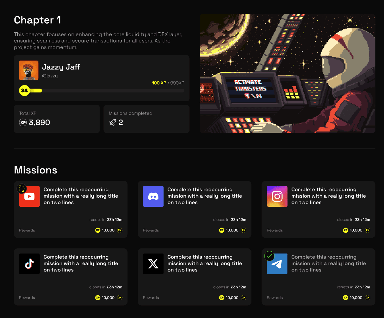
We want Drops to be an airdrop homepage where projects launching here are proud to show off. That’s why we’ve made a tonne of changes to the first point of contact most users will experience. We’ve reimagined nearly every element of the Projects homepage, from the user bar to the Chapter modals to the navigation. We’re confident this is going to increase the conversion rate of people participating in airdrops, as well as make the experience that much more enjoyable.
New Homepage
It's now easier to explore different drops projects than ever. We've added a new homepage which is super easy to navigate, with filters to view projects by chain.
New Home
Our homepage needed some love, and we’ve given it. Now we understand our user behaviour better, we’ve used a combination of hard data and user feedback to design a homepage that let’s users easily understand and dive in to our different products.
Want to discover and invest in the latest, biggest Launch meme coin? Want to earn airdrop rewards all in one place? Want to to launch a token of your own in 10 seconds? Want to participate in the launchpad?
No matter what you’re looking to do on ZAP, our homepage now makes it super easy to understand our different products, and dive into each. More below.
Redesign
You’ve probably noticed a theme with our new feature releases. Everything looks a bit different. We’ve implemented a new design that compliments our philosophy of simplicity, whereas on the old ZAP pages there was a lot of fun, but superfluous ‘furniture’ (whatever that means - you'll have to ask our designers). We’ve now stripped everything back!
All design elements must now earn their place, and everything must have a purpose. As well as cutting back on the overall ‘stuff’ on pages, we’ve also bought in a cleaner user interface that prioritises timelessness and readability over more trendy components.
That isn’t to say our new design doesn’t retain some of the boldness of before, we’re using ‘ZAP Yellow’ more prominently throughout the product and will also heavily lean into it when it comes to social posts. But all in all, the new design is sleeker, bolder, and better than before, with easier navigation and - hopefully - a bit easier on the eyes.
We’ll release a full document on our design language in the coming weeks, but for now, take a look at a few of the shots below to get an idea of what we’re talking about.
We think ZAP 2.0 gives us a solid foundation to build upon. Three products living in harmony with one another, a design system that ties everything together, and a new blockchain to branch to where we see insane upside, plus a couple of big new product iterations that we are confident will better serve the market.
To the moon.
Love, Carlo, Ralph, Xiao Xu, Salt, Badge, Prodigo, Kunal (ZAP Product Team)
Stay Connected
For the latest updates and announcements, follow us on Twitter.
Gm Zappers!
The past few months has been a wild ride.
We’ve won the Blast Big Bang competition, launched three products, onboarded hundreds of thousands of users to our platform, started monetising, and raised $15m on the back of the early traction and promise our company has owned - with a massive thank you especially to the community of ZAP Vault Holders.
ZAP 2.0 ⚡
In this early phase we’ve been talking to our users, taking stock of the macro picture and tactically putting together a vision for what the future of ZAP looks like. We’ve been brainstorming, wireframing, designing, coding, and strategising.
We’re now beyond excited to share ZAP 2.0 with the world.
ZAP 2.0 is the natural evolution of ZAP. There are a few major changes, and a number of smaller ones. Our vision to become the place communities come to launch tokens—whether that’s through an airdrop, coin creator or more traditional launchpad style raise—remains the same, but how we deliver on this vision has definitely changed.
In this article, we’ll go through some of the bigger changes (and some of the smaller ones) that make ZAP 2.0 a change step from our original product
Addition of Base Network 🔵
Probably one of the bigger changes we’ve implemented is the addition of the Base Network onto ZAP. As a team, we are super bullish on the Base ecosystem. The mission of Base "To build a global onchain economy that increases innovation, creativity, and freedom" ties closely into ZAP’s.
As well as this, the on-chain activity that Base network has seen recently can’t be argued with. Base has quickly come to be the EVM chain of choice when it comes to new token activity, which is precisely the market that ZAP plays in.
Our new Launch product (more on that later) as well as Labs and Drops are now open to Base projects. We’ll also be launching a Base native campaign shortly (sorry we can’t reveal more on that yet) to kickstart the flywheel of onboarding Base users to the ZAP ecosystem.
As mentioned in our recent post, we’ll continue providing support for the Blast network, but for the next few weeks while we get the Base flywheel moving you will a Base focus on all of our products. We fully believe in the promise of Blast as the yield-native chain, but we’re also making sure we provide a clear, simple UX for new users as we expand to Base with the coming campaigns.
Brand new ZAP Launches
Our original launches product failed to get as much traction or success as our Drops product. We’ve spent the last few months trying to figure out why. While there’s definitely a market elements to this, with lacklustre demand for the Blast blockchain from token developers and degens, we also heard loud and clear that our Launch product was just too complicated.
We prioritised customisation, thinking that if we could deliver a super sophisticated token launcher experience, developers would love the flexibility that it offered. In hindsight, it would appear we built a product for a market that doesn’t quite exist yet, developers either want fully custom tokens, or are happy with a simple template.
Simplified Token Creation
10 seconds and 3 bucks. That’s all it now takes to launch a token on ZAP. We’ve completely overhauled our token launch experience to prioritise simplicity above all else. We’ve also implemented some pretty smart bonding curve logic, so that tokens can be launched with zero liquidity. Pretty cool.
Check out the whole launch experience in the video below 👇🏽
Transparency First
One of the key issues users of token launchers said they faced was a lack of transparency around the trading activity in these tokens. People want a safe playground to launch and buy new tokens and other platforms were failing to deliver.
That’s why we’ve partnered with Nansen to assign all users a ZAP Value Index (ZVI). This index takes into account multiple parameters like a user’s trading history, amount spent on gas, and other on-chain activity, to give users an indication of who is buying and selling the token they’re interested in. We have big plans for surfacing helpful information through our platform and this is just the first step.

Secret Feature
There’s another feature we’ve implemented that we are perhaps most bullish about. We’ll do a full write up on this feature in the coming weeks, for now you’ll just have to use the platform to get a chance to see it in the wild!
Complete Redesign for ZAP Drops
So far, ZAP Drops has been our most popular product. The ZAP Gigadrops campaign proved to be a big driver of new users, and we also got some great feedback from our clients. The changes we’ve made to ZAP Drops for 2.0 have therefore been less extensive than with Launch - it’s been more about perfecting the UX, obsessing over small details, and generally making the product as seamless as possible.
New Project Home UX
We want Drops to be an airdrop homepage where projects launching here are proud to show off. That’s why we’ve made a tonne of changes to the first point of contact most users will experience. We’ve reimagined nearly every element of the Projects homepage, from the user bar to the Chapter modals to the navigation. We’re confident this is going to increase the conversion rate of people participating in airdrops, as well as make the experience that much more enjoyable.

New Homepage
It's now easier to explore different drops projects than ever. We've added a new homepage which is super easy to navigate, with filters to view projects by chain.
New Home
Our homepage needed some love, and we’ve given it. Now we understand our user behaviour better, we’ve used a combination of hard data and user feedback to design a homepage that let’s users easily understand and dive in to our different products.
Want to discover and invest in the latest, biggest Launch meme coin? Want to earn airdrop rewards all in one place? Want to to launch a token of your own in 10 seconds? Want to participate in the launchpad?
No matter what you’re looking to do on ZAP, our homepage now makes it super easy to understand our different products, and dive into each. More below.
Redesign
You’ve probably noticed a theme with our new feature releases. Everything looks a bit different. We’ve implemented a new design that compliments our philosophy of simplicity, whereas on the old ZAP pages there was a lot of fun, but superfluous ‘furniture’ (whatever that means - you'll have to ask our designers). We’ve now stripped everything back!
All design elements must now earn their place, and everything must have a purpose. As well as cutting back on the overall ‘stuff’ on pages, we’ve also bought in a cleaner user interface that prioritises timelessness and readability over more trendy components.
That isn’t to say our new design doesn’t retain some of the boldness of before, we’re using ‘ZAP Yellow’ more prominently throughout the product and will also heavily lean into it when it comes to social posts. But all in all, the new design is sleeker, bolder, and better than before, with easier navigation and - hopefully - a bit easier on the eyes.
We’ll release a full document on our design language in the coming weeks, but for now, take a look at a few of the shots below to get an idea of what we’re talking about.
We think ZAP 2.0 gives us a solid foundation to build upon. Three products living in harmony with one another, a design system that ties everything together, and a new blockchain to branch to where we see insane upside, plus a couple of big new product iterations that we are confident will better serve the market.
To the moon.
Love, Carlo, Ralph, Xiao Xu, Salt, Badge, Prodigo, Kunal (ZAP Product Team)
Stay Connected
For the latest updates and announcements, follow us on Twitter.
Gm Zappers!
The past few months has been a wild ride.
We’ve won the Blast Big Bang competition, launched three products, onboarded hundreds of thousands of users to our platform, started monetising, and raised $15m on the back of the early traction and promise our company has owned - with a massive thank you especially to the community of ZAP Vault Holders.
ZAP 2.0 ⚡
In this early phase we’ve been talking to our users, taking stock of the macro picture and tactically putting together a vision for what the future of ZAP looks like. We’ve been brainstorming, wireframing, designing, coding, and strategising.
We’re now beyond excited to share ZAP 2.0 with the world.
ZAP 2.0 is the natural evolution of ZAP. There are a few major changes, and a number of smaller ones. Our vision to become the place communities come to launch tokens—whether that’s through an airdrop, coin creator or more traditional launchpad style raise—remains the same, but how we deliver on this vision has definitely changed.
In this article, we’ll go through some of the bigger changes (and some of the smaller ones) that make ZAP 2.0 a change step from our original product
Addition of Base Network 🔵
Probably one of the bigger changes we’ve implemented is the addition of the Base Network onto ZAP. As a team, we are super bullish on the Base ecosystem. The mission of Base "To build a global onchain economy that increases innovation, creativity, and freedom" ties closely into ZAP’s.
As well as this, the on-chain activity that Base network has seen recently can’t be argued with. Base has quickly come to be the EVM chain of choice when it comes to new token activity, which is precisely the market that ZAP plays in.
Our new Launch product (more on that later) as well as Labs and Drops are now open to Base projects. We’ll also be launching a Base native campaign shortly (sorry we can’t reveal more on that yet) to kickstart the flywheel of onboarding Base users to the ZAP ecosystem.
As mentioned in our recent post, we’ll continue providing support for the Blast network, but for the next few weeks while we get the Base flywheel moving you will a Base focus on all of our products. We fully believe in the promise of Blast as the yield-native chain, but we’re also making sure we provide a clear, simple UX for new users as we expand to Base with the coming campaigns.
Brand new ZAP Launches
Our original launches product failed to get as much traction or success as our Drops product. We’ve spent the last few months trying to figure out why. While there’s definitely a market elements to this, with lacklustre demand for the Blast blockchain from token developers and degens, we also heard loud and clear that our Launch product was just too complicated.
We prioritised customisation, thinking that if we could deliver a super sophisticated token launcher experience, developers would love the flexibility that it offered. In hindsight, it would appear we built a product for a market that doesn’t quite exist yet, developers either want fully custom tokens, or are happy with a simple template.
Simplified Token Creation
10 seconds and 3 bucks. That’s all it now takes to launch a token on ZAP. We’ve completely overhauled our token launch experience to prioritise simplicity above all else. We’ve also implemented some pretty smart bonding curve logic, so that tokens can be launched with zero liquidity. Pretty cool.
Check out the whole launch experience in the video below 👇🏽
Transparency First
One of the key issues users of token launchers said they faced was a lack of transparency around the trading activity in these tokens. People want a safe playground to launch and buy new tokens and other platforms were failing to deliver.
That’s why we’ve partnered with Nansen to assign all users a ZAP Value Index (ZVI). This index takes into account multiple parameters like a user’s trading history, amount spent on gas, and other on-chain activity, to give users an indication of who is buying and selling the token they’re interested in. We have big plans for surfacing helpful information through our platform and this is just the first step.

Secret Feature
There’s another feature we’ve implemented that we are perhaps most bullish about. We’ll do a full write up on this feature in the coming weeks, for now you’ll just have to use the platform to get a chance to see it in the wild!
Complete Redesign for ZAP Drops
So far, ZAP Drops has been our most popular product. The ZAP Gigadrops campaign proved to be a big driver of new users, and we also got some great feedback from our clients. The changes we’ve made to ZAP Drops for 2.0 have therefore been less extensive than with Launch - it’s been more about perfecting the UX, obsessing over small details, and generally making the product as seamless as possible.
New Project Home UX
We want Drops to be an airdrop homepage where projects launching here are proud to show off. That’s why we’ve made a tonne of changes to the first point of contact most users will experience. We’ve reimagined nearly every element of the Projects homepage, from the user bar to the Chapter modals to the navigation. We’re confident this is going to increase the conversion rate of people participating in airdrops, as well as make the experience that much more enjoyable.

New Homepage
It's now easier to explore different drops projects than ever. We've added a new homepage which is super easy to navigate, with filters to view projects by chain.
New Home
Our homepage needed some love, and we’ve given it. Now we understand our user behaviour better, we’ve used a combination of hard data and user feedback to design a homepage that let’s users easily understand and dive in to our different products.
Want to discover and invest in the latest, biggest Launch meme coin? Want to earn airdrop rewards all in one place? Want to to launch a token of your own in 10 seconds? Want to participate in the launchpad?
No matter what you’re looking to do on ZAP, our homepage now makes it super easy to understand our different products, and dive into each. More below.
Redesign
You’ve probably noticed a theme with our new feature releases. Everything looks a bit different. We’ve implemented a new design that compliments our philosophy of simplicity, whereas on the old ZAP pages there was a lot of fun, but superfluous ‘furniture’ (whatever that means - you'll have to ask our designers). We’ve now stripped everything back!
All design elements must now earn their place, and everything must have a purpose. As well as cutting back on the overall ‘stuff’ on pages, we’ve also bought in a cleaner user interface that prioritises timelessness and readability over more trendy components.
That isn’t to say our new design doesn’t retain some of the boldness of before, we’re using ‘ZAP Yellow’ more prominently throughout the product and will also heavily lean into it when it comes to social posts. But all in all, the new design is sleeker, bolder, and better than before, with easier navigation and - hopefully - a bit easier on the eyes.
We’ll release a full document on our design language in the coming weeks, but for now, take a look at a few of the shots below to get an idea of what we’re talking about.
We think ZAP 2.0 gives us a solid foundation to build upon. Three products living in harmony with one another, a design system that ties everything together, and a new blockchain to branch to where we see insane upside, plus a couple of big new product iterations that we are confident will better serve the market.
To the moon.
Love, Carlo, Ralph, Xiao Xu, Salt, Badge, Prodigo, Kunal (ZAP Product Team)
Stay Connected
For the latest updates and announcements, follow us on Twitter.
More Updates
Jan 18, 2025

A big year ahead for ZAP, connecting capital with community via a gamified memecoin launcher: Responsible Buybacks: Continued commitment to buybacks while maintaining long-term sustainability. Focus Shift: Prioritizing token launches and onboarding Web2 users with social sign-ons, fiat ramps, and a sleek UI. Marketing Push: Partnered with Lifted Management to expand on TikTok, Snapchat, and Instagram with viral campaigns. Fair Launch Innovation: Developing customizable bonding curves for fairer token launches and exploring traditional launchpad models in partnership with Tier 1 teams. AI Opportunities: Exploring ways to leverage the growing AI narrative for innovation in trading and engagement. CTZN Project: Transitioning management to ensure CTZN has its own identity and value beyond airdrops.

A big year ahead for ZAP, connecting capital with community via a gamified memecoin launcher: Responsible Buybacks: Continued commitment to buybacks while maintaining long-term sustainability. Focus Shift: Prioritizing token launches and onboarding Web2 users with social sign-ons, fiat ramps, and a sleek UI. Marketing Push: Partnered with Lifted Management to expand on TikTok, Snapchat, and Instagram with viral campaigns. Fair Launch Innovation: Developing customizable bonding curves for fairer token launches and exploring traditional launchpad models in partnership with Tier 1 teams. AI Opportunities: Exploring ways to leverage the growing AI narrative for innovation in trading and engagement. CTZN Project: Transitioning management to ensure CTZN has its own identity and value beyond airdrops.
Jan 18, 2025

A big year ahead for ZAP, connecting capital with community via a gamified memecoin launcher: Responsible Buybacks: Continued commitment to buybacks while maintaining long-term sustainability. Focus Shift: Prioritizing token launches and onboarding Web2 users with social sign-ons, fiat ramps, and a sleek UI. Marketing Push: Partnered with Lifted Management to expand on TikTok, Snapchat, and Instagram with viral campaigns. Fair Launch Innovation: Developing customizable bonding curves for fairer token launches and exploring traditional launchpad models in partnership with Tier 1 teams. AI Opportunities: Exploring ways to leverage the growing AI narrative for innovation in trading and engagement. CTZN Project: Transitioning management to ensure CTZN has its own identity and value beyond airdrops.
Nov 28, 2024
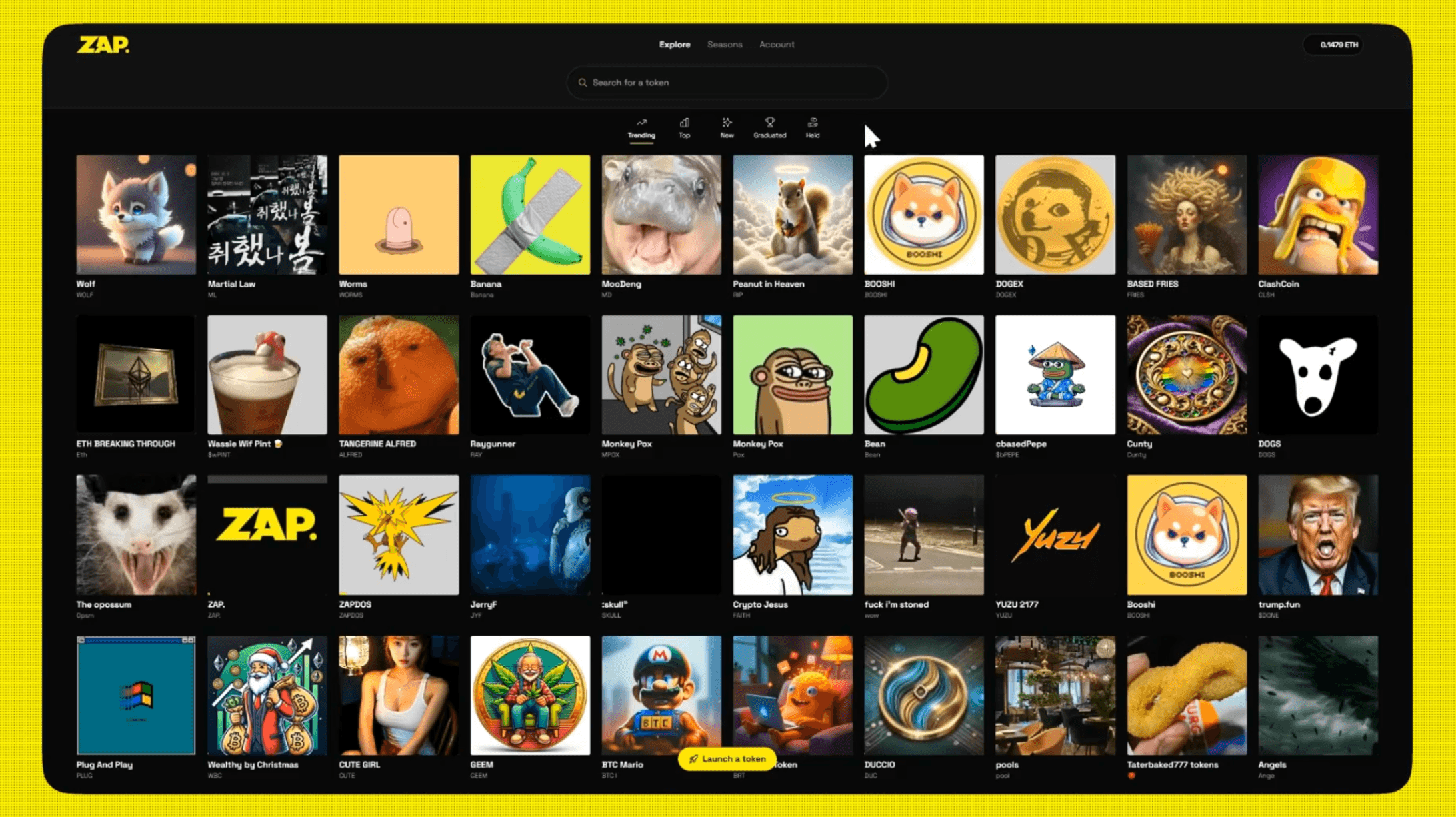
ZAP makes meme coin trading fun, easy, and rewarding through gamification and a mobile-first design. Complete quests, earn rewards, and compete in weekly seasons for big prizes—all within a web2-inspired interface perfect for new crypto users and degens alike. Key Features: 🎯 Mobile-First Design: Intuitive, user-friendly experience. 🎟️ Quests & Rewards: Trade and complete tasks to earn tickets. 🏆 Weekly Seasons: Win 1% of graduating tokens + exclusive prizes.

ZAP makes meme coin trading fun, easy, and rewarding through gamification and a mobile-first design. Complete quests, earn rewards, and compete in weekly seasons for big prizes—all within a web2-inspired interface perfect for new crypto users and degens alike. Key Features: 🎯 Mobile-First Design: Intuitive, user-friendly experience. 🎟️ Quests & Rewards: Trade and complete tasks to earn tickets. 🏆 Weekly Seasons: Win 1% of graduating tokens + exclusive prizes.
Nov 28, 2024

ZAP makes meme coin trading fun, easy, and rewarding through gamification and a mobile-first design. Complete quests, earn rewards, and compete in weekly seasons for big prizes—all within a web2-inspired interface perfect for new crypto users and degens alike. Key Features: 🎯 Mobile-First Design: Intuitive, user-friendly experience. 🎟️ Quests & Rewards: Trade and complete tasks to earn tickets. 🏆 Weekly Seasons: Win 1% of graduating tokens + exclusive prizes.
Nov 28, 2024
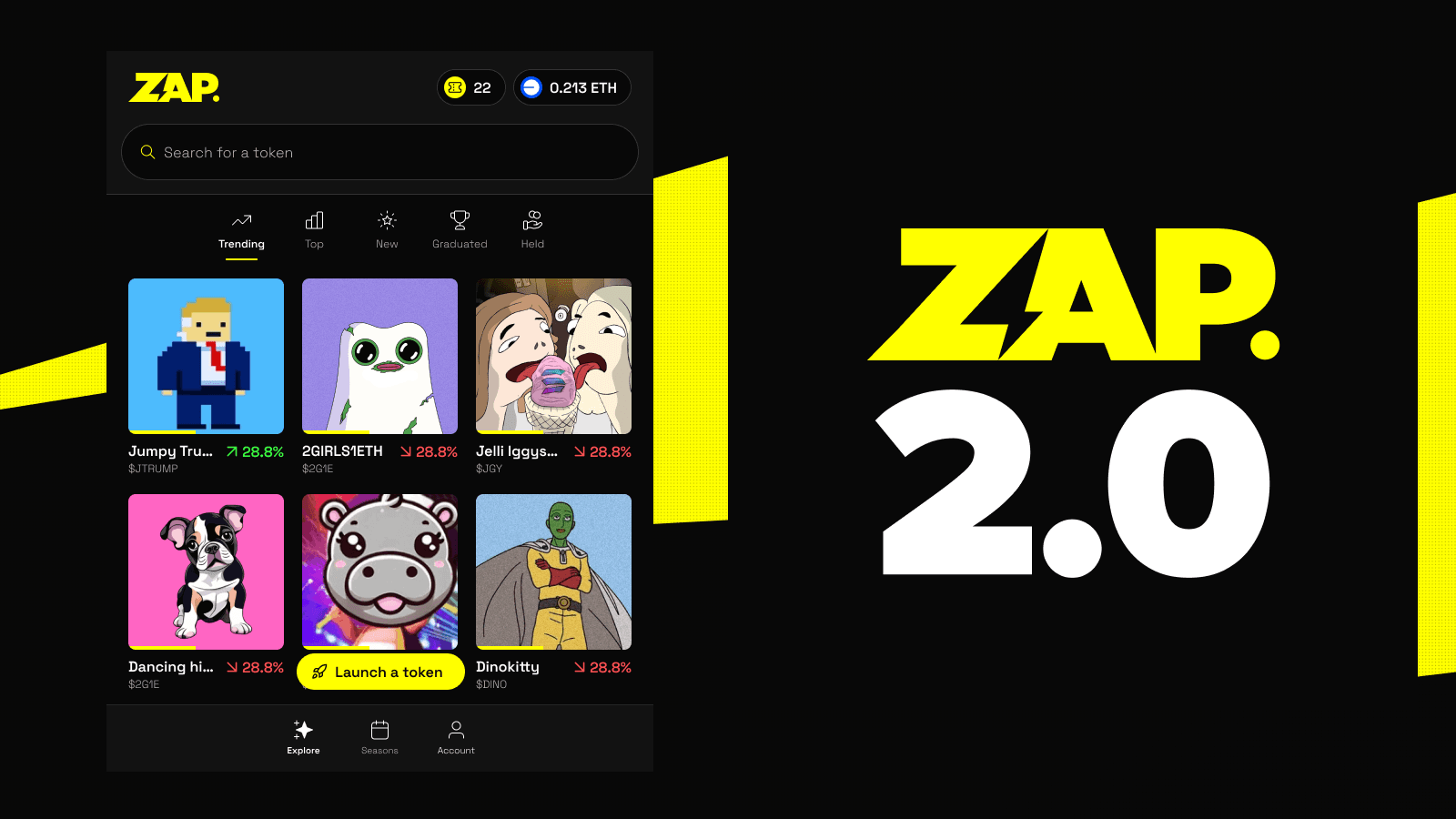
Bringing the fun to crypto, ZAP combines gamification, simplicity, and mobile-first design to make meme coin trading accessible to everyone. Complete quests, earn rewards, and participate in weekly seasons for a chance to win big—all while enjoying a streamlined web2-inspired interface. Perfect for new crypto users coming from social apps like TikTok. New Features: Redefined Design: Intuitive, mobile-first interface tailored for ease of use. Meme Coin Quests: Earn lottery tickets by trading and completing daily/weekly tasks. Weekly Seasons: Win 1% of all graduating tokens and other exclusive prizes.

Bringing the fun to crypto, ZAP combines gamification, simplicity, and mobile-first design to make meme coin trading accessible to everyone. Complete quests, earn rewards, and participate in weekly seasons for a chance to win big—all while enjoying a streamlined web2-inspired interface. Perfect for new crypto users coming from social apps like TikTok. New Features: Redefined Design: Intuitive, mobile-first interface tailored for ease of use. Meme Coin Quests: Earn lottery tickets by trading and completing daily/weekly tasks. Weekly Seasons: Win 1% of all graduating tokens and other exclusive prizes.
Nov 28, 2024

Bringing the fun to crypto, ZAP combines gamification, simplicity, and mobile-first design to make meme coin trading accessible to everyone. Complete quests, earn rewards, and participate in weekly seasons for a chance to win big—all while enjoying a streamlined web2-inspired interface. Perfect for new crypto users coming from social apps like TikTok. New Features: Redefined Design: Intuitive, mobile-first interface tailored for ease of use. Meme Coin Quests: Earn lottery tickets by trading and completing daily/weekly tasks. Weekly Seasons: Win 1% of all graduating tokens and other exclusive prizes.
Subscribe to Updates
Add your email below to receive an email for every newly launched feature we announce.


Subscribe to Updates
Add your email below to receive an email for every newly launched feature we announce.
Subscribe to Updates
Add your email below to receive an email for every newly launched feature we announce.